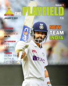
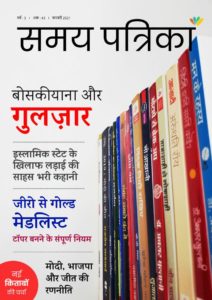
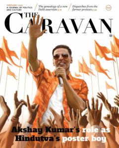
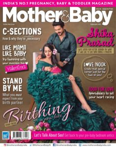
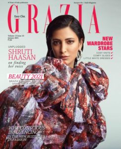
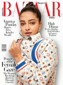
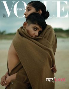
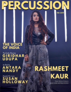
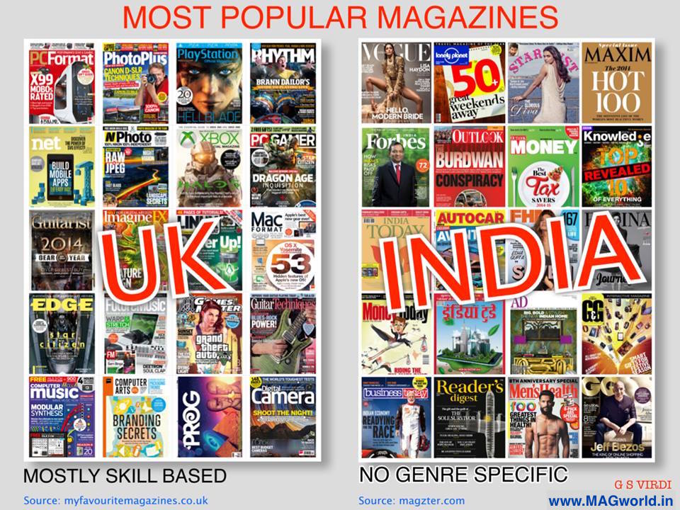
Newsstands as we observe…
New Launches – February 2021
Noticeable Covers of February 2021
New Launches
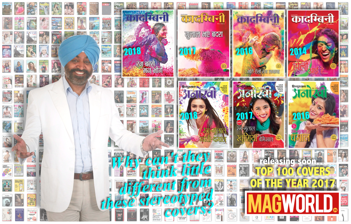 Stereotyped Holi Special Covers! – Mar 2018 Why can’t they come up with something different from such stereotyped covers every year?? Look at ‘Anokhi’.. they have not even bothered to changed their copy – ‘Rang-Gulaal’ since last 3 years? Probably they are comfortable with ‘Save As’ option.
Double Covers of the Launch Issue of ‘BRIDES Today’ – Feb 2018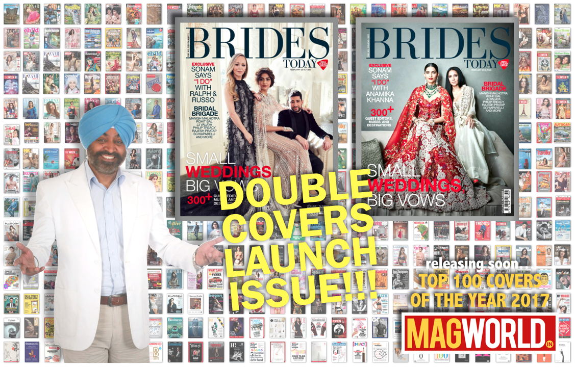
 MAIN HU KISAN – Sep 2017
The most pathetic cover of any magazine I have seen so far!
Just look at the masthead – Main Hu Kisan, and then look at the main visual and the cover stories(?). Do you see any connection between the genre of the magazine (as its title suggests) and the main visual? It happens when a magazine is managed by a person with no publishing & editorial skills.
As a magazine critic, all I can say on this cover – What were they thinking?
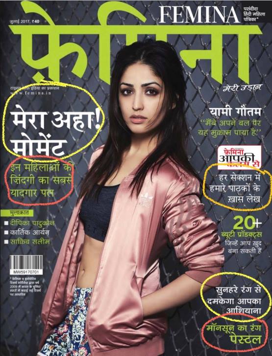
Whom are they talking – Jul 2017
Worst cover stories (copy) I have seen on the latest issue of Femina Hindi! No connection to the audience, no hook, grammatically incorrect… that too on the cover itself, I am shocked. Definitely they don’t know their reader.
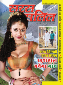
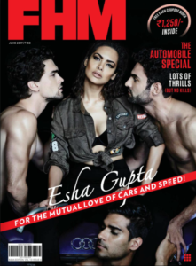
Disconnected Covers – Jul 2017
Some publishers don’t even understand the connection between the Main Visual and the cover story (or theme) of the issue!
Were you able to guess the theme of this ‘special’ issue by just looking at main visual on the cover of FHM?? without reading on the top right corner obviously…![]()
Or can you imagine a ‘Happy Village’ after looking at the model on the cover of SARAS SALIL? BTW, the cover story is about the SARPANCH.
In fact, you start scratching your head when you read the theme and look again at the visuals…!
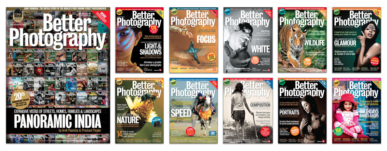 BETTER PHOTOGRAPHY – Jun 2017: They should realise that in order to make ‘zara hatke’ (or call it ‘extra ordinary’ cover) for the ‘special’ (anniversary) issue, they actually produce the worse cover! Look at the regular covers (All on the Right); they are focused, logical, thoughtful, disciplined, branded and are still creative unlike the ‘special’ cover (on the Left). In the name of ‘special’ you cannot do just whatever you want to do… at least the regular covers have strong connection between the theme of the issue, the main visual and the main cover story. Latest cover of BP anniversary issue is not even aesthetically pleasing.
MAXIM - Jun/Jul 2017
One more badly designed cover! MAXIM’s 'HOT 100’ special issue…A good photograph… but poor visualisation…unattractive copy for the cover stories… weight imbalance… very indisciplined & basic mistakes of making a great cover of a special issue… looks very shallow issue by looking at this cover (Left). Some of the past covers (all on the Right) were great in comparison to this current issue… even that ‘only text’ cover was also better at least that one had minimum elements on the covers and therefore there was lesser scope left for the creative team for creating mistakes.
ELLE - May 2017
Still lot to learn before Indian magazines go for such covers (left) in the line of foreign magazines (all on the right). This could be a great cover of ELLE (India) but they just spoiled the opportunity.
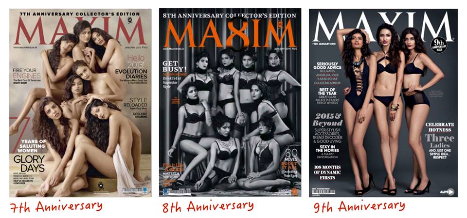
This time it is not looking like MAXIM’s Anniversary cover et al…
It happens when you don't realise that the lead image of a story and the cover page of a magazine are two different things and they have different responsibilities on their shoulders... hence both need to be designed differently keeping their individual way of communication to the reader in mind.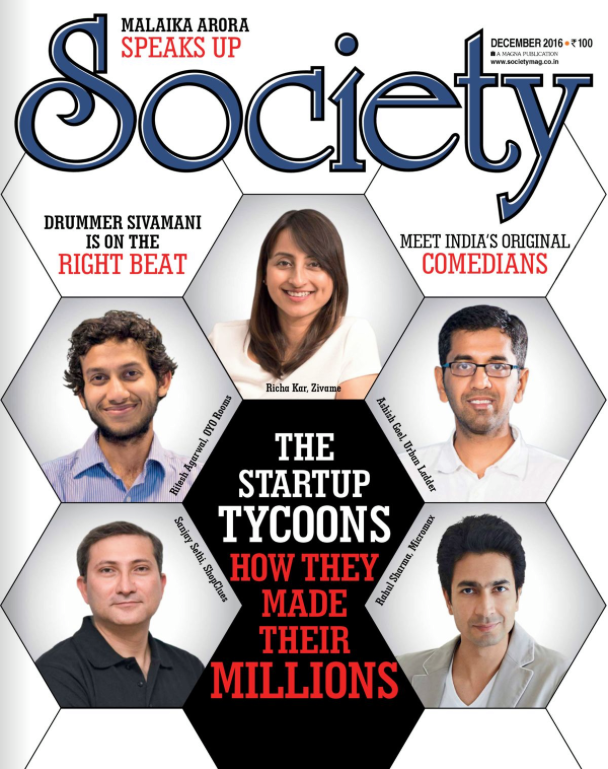
Most of the publications do this blunder when they come up with their 'special' or 'anniversary' issues; In order to come up with 'so innovative' or 'Out of the box idea' or 'something unique', they generally end up with some below average and stupid cover as compared to their 'regular' covers. This so amateur looking cover is the cover of 41st Anniversary issue of India Today magazine.
Others feel happy in October month as it is the month of festivals...lots of shoppings...winter starts... I love October because many of Indian Magazines have their Anniversaries... special editions...
'...ek baat kahun beta, ye cover bilkul hi pasand nahin aaya merko '
Jokes apart, how can a serious brand do such a bad job? Lack of editorial point of view, poor Image processing, just a random and thoughtless cluttered typography, illogical shadows... horrible cover of such a reputed brand.

